Home Renovation & Remodelling Ideas
Inspiration, guides, and ideas to design the home of your dreams.
Latest Articles
-
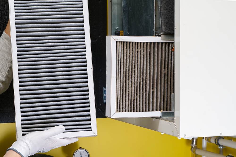
Top 10 HVAC Maintenance Tips Every Homeowner Should Know
-
Designing Around Trouble Spots: How to Make Ugly Pipes Look Intentional
-
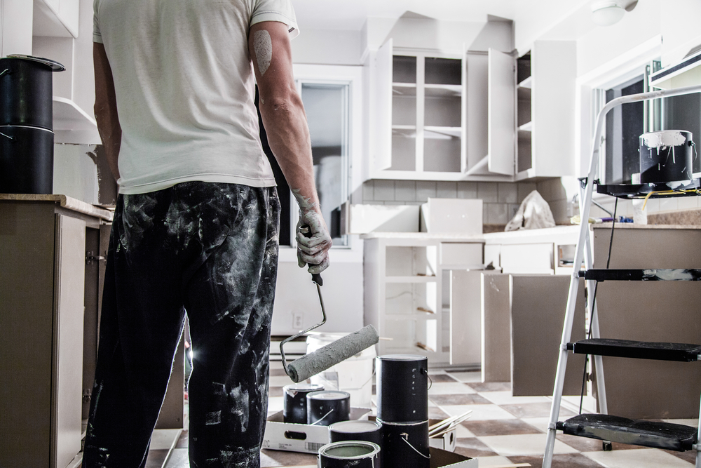
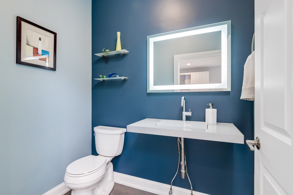
5 Common Plumbing Mistakes to Avoid in Kitchen Renovations (Design + Practical Fixes)
-

How Sarah Bronstein Merges Style and Function in Tiny Homes
-

How Upcycling and DIY Blend in Chas Greener’s Creative World
-
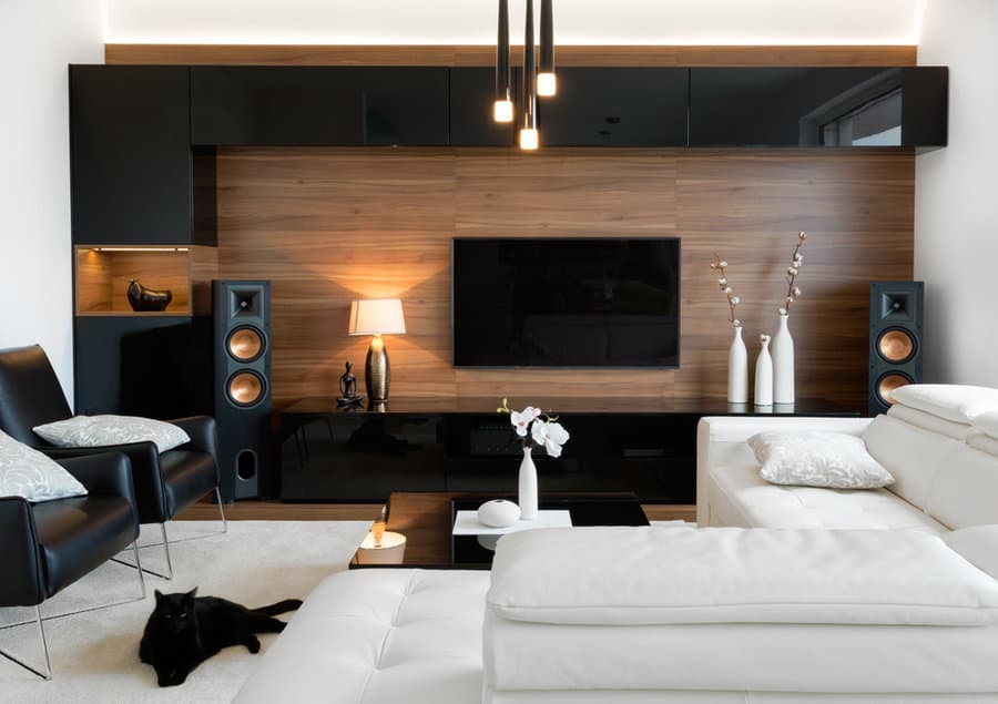
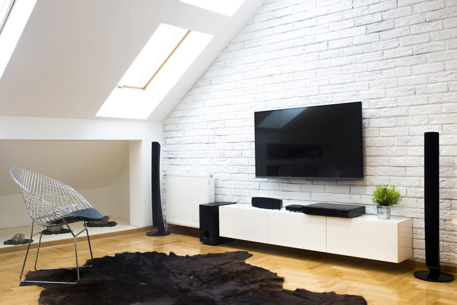
How to Arrange Living Room Furniture With a TV
Browse By Room
Pick a room and explore design ideas tailored for it.